Amor Mio
Brand Identity Design
A playful and culturally-rooted visual identity for a Valentine's Day floral campaign merging tradition with modern edge.
View ProjectGina Rose Baiamonte of Altar Floral approached us after years of operating without clear brand differentiation in a saturated market. While she possessed extensive knowledge about the symbolic meaning and folklore behind different flowers this unique knowledge of hers wasn't being communicated to potential clients. She needed a brand identity that could bridge the gap between her artistic, ceremonial approach and the high-end wedding and event market she wanted to keep serving.
Project Scope
Credits
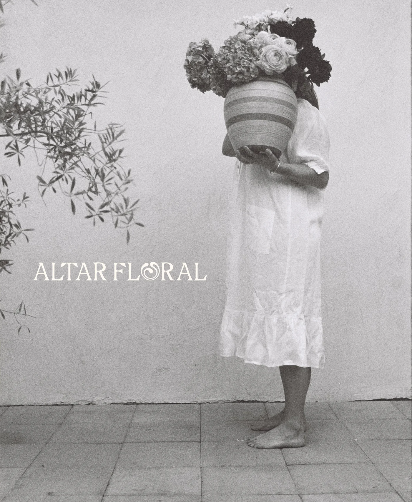
We approached this brand identity with the goal of balancing what Gina described as an identity that’s "daring and contemplative". We wanted to create a visual language that could feel bold and experimental while remaining grounded in ancient plant wisdom. The strategy centered on Altar Floral's core values: ceremonial artistry (creating meaningful experiences through plant folklore and symbolism), sustainable innovation (using eco-friendly materials like chicken wire instead of foam), and quiet confidence (letting the work speak for itself while maintaining warmth). Rather than defaulting to the soft, romantic aesthetic that dominates floral branding, we developed a more editorial, almost architectural visual system that positioned Gina as both artist and educator.
The primary logo's distinctive "O" — inspired by the curling petals of chrysanthemums and their symbolism of longevity and warmth — became the conceptual anchor for the entire identity. This organic interruption in the wordmark signaled to viewers that Gina’s got something different to say, something unexpected.


We designed multiple brandmarks to give Gina maximum flexibility: an AF monogram incorporating the chrysanthemum-inspired curves, a vase illustration filled with abstract floral elements, and a script signature mark using vintage-inspired typography. The vase mark became a powerful storytelling device on the site. Its deliberately imperfect, hand-drawn feel reinforces the brand's values of authenticity and organic beauty.

The website needed to function as both portfolio and education platform, showcasing Gina's work while communicating her unique approach rooted in plant folklore and symbolism. Steph Laffy, our copywriter, developed a copywriting strategy that positioned her as both artist and teacher, creating space for explaining the "why" behind her arrangements, not just displaying the "what." Gina and Steph made sure that each page explained not just what clients would receive, but the ceremonial intention and plant wisdom behind everything that Gina does.
The website had to serve multiple audiences simultaneously: brides seeking high-end wedding florals, corporate clients booking installations, and individuals interested in educational workshops. We needed a design system sophisticated enough for luxury wedding clients while remaining approachable for workshop participants.


Large-scale display typography created dramatic moments that drew the eye, while thoughtful use of whitespace gave content room to breathe.
We created custom interactions and animations that reinforced the brand's contemplative, ceremonial nature such as subtle image scrolling effects that created movement without distraction and transitions between sections that felt organic rather than jarring and sharp.
The services page specifically was designed to educate and inspire. Each offering explained through the lens of ceremonial intention and plant symbolism, with clear calls-to-action that didn't feel pushy or sales-driven. This balanced Gina's desire to maintain warmth and approachability with the practical need to drive business inquiries.

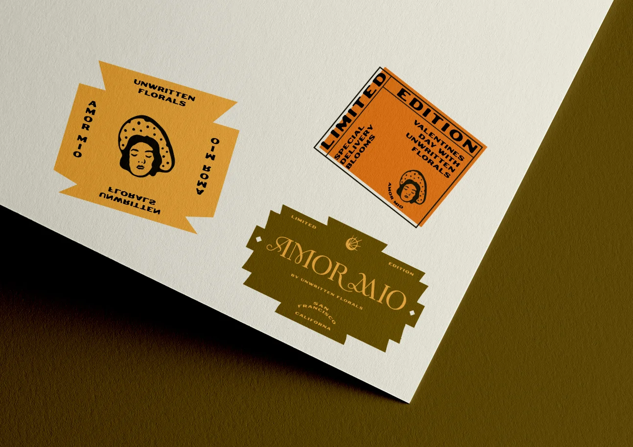
A playful and culturally-rooted visual identity for a Valentine's Day floral campaign merging tradition with modern edge.
View Project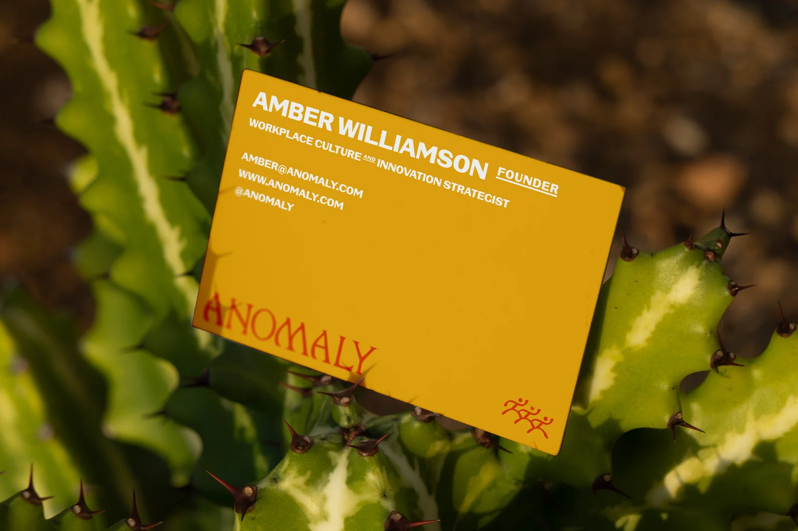
A grounded and tactile brand identity for a leadership consultant bridging equity work with measurable business outcomes.
View Project
Good. We like that in a person.
Your business deserves more than half-measures and safe plays. It deserves your full, unfiltered, turned-up-to-one million energy.
We’ll help you build the brand that can actually hold it.
