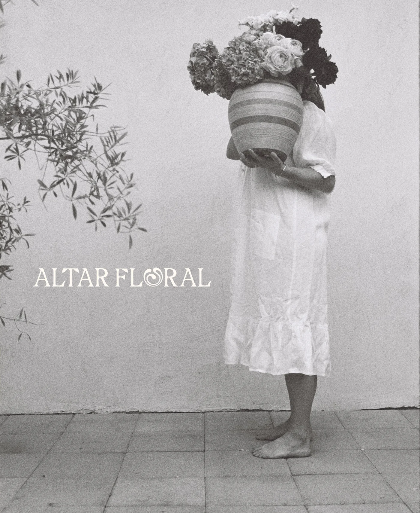
Altar Floral
A ceremonial and contemplative brand identity for a floral designer merging plant folklore with sustainable artistry.
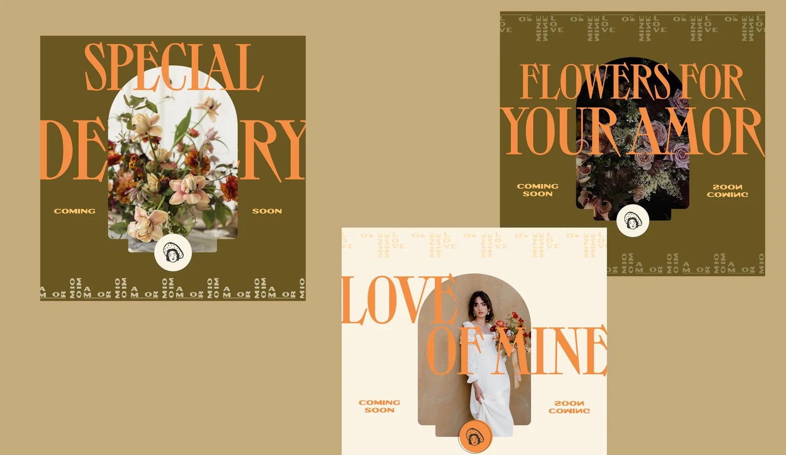
View ProjectVanessa reached out looking for a help bringing to life a limited edition special Valentine’s Day campaign called “Amor Mio” which translates from Spanish to “love of mine.”
We approached this limited edition campaign as an opportunity to create something that felt celebratory and collectible. The strategy centered on blending Vanessa's Spanish heritage with a modern, experimental edge that would feel unexpected in her industry. We drew inspiration from traditional Spanish design elements—papel picado banners, vintage poster typography, and festival graphics—and reinterpreted them through a contemporary rebellious lens. The result was a visual identity that honored cultural roots while feeling fresh, bold, and distinctly "limited edition."
Project Scope

This campaign needed to work cohesively with Unwritten Florals' existing brand identity while still feeling special and distinct enough to stand on it’s own. We also needed to create a suite flexible enough to work across multiple touchpoints—from stickers and care cards to social media graphics—while maintaining budget-consciousness for a small business Valentine's campaign. The color palette had to feel romantic and Spanish-inspired without becoming too predictable or overly feminine, striking that delicate balance between softness and strength that defines Vanessa's floral work.


We designed a custom repeating border pattern inspired by traditional Spanish design motifs and papel picado, reimagined as an infinitely repeating element that could function as both decoration and as a brand device. The playful "woman in the hat" graphic became a signature mark throughout the suite—appearing on badges, stickers, and marketing materials as a subtle nod to Spanish heritage with a modern, almost whimsical feel.
The experimental typography combination of Toy (a bold, high-contrast display face) paired with Outpost (a rugged, western-leaning font) created visual tension that kept the identity from skewing too sweet or traditional. Even the color palette was carefully desaturated—cosmic latte, cadmium orange, maximum yellow red, light French beige, and Spanish bistre—to keep things soft, earthy, and romantic rather than overly saturated or garish. Every element, from the arched care card shape to the vintage postage-inspired sticker designs, was crafted to make receiving an Amor Mio arrangement feel like unwrapping a special, thoughtfully designed gift.

A ceremonial and contemplative brand identity for a floral designer merging plant folklore with sustainable artistry.
View Project
A grounded and tactile brand identity for a leadership consultant bridging equity work with measurable business outcomes.
View Project
Good. We like that in a person.
Your business deserves more than half-measures and safe plays. It deserves your full, unfiltered, turned-up-to-one million energy.
We’ll help you build the brand that can actually hold it.
